This project was an exploration into the possibilities of a rebrand of 6VT Youth Cafe based in Vennel, Edinburgh.
Through visual research into the the current brand it was evident that 6VT struggled with consistency through their branding and had a bit of an identity issue now that they have moved on from their former residence in 6 Victoria Terrace.
We wanted to resolve this by re-focusing on the 6 services that 6VT offer for a stronger brand image.
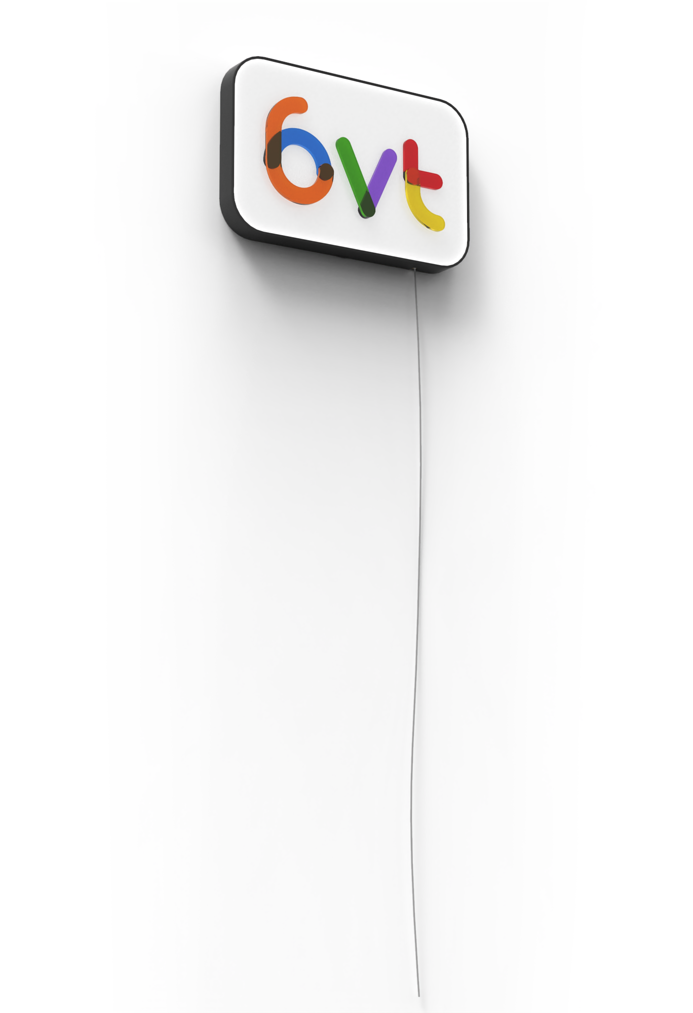
For this we created a branding system. The main 6VT logo compromises of 6 different lines and colours coming together to make one marque. This is symbolic of 6VT as it attracts many different people of all ages and backgrounds and brings them together in a safe and fun environment
For this we created a branding system. The main 6VT logo compromises of 6 different lines and colours coming together to make one marque. This is symbolic of 6VT as it attracts many different people of all ages and backgrounds and brings them together in a safe and fun environment
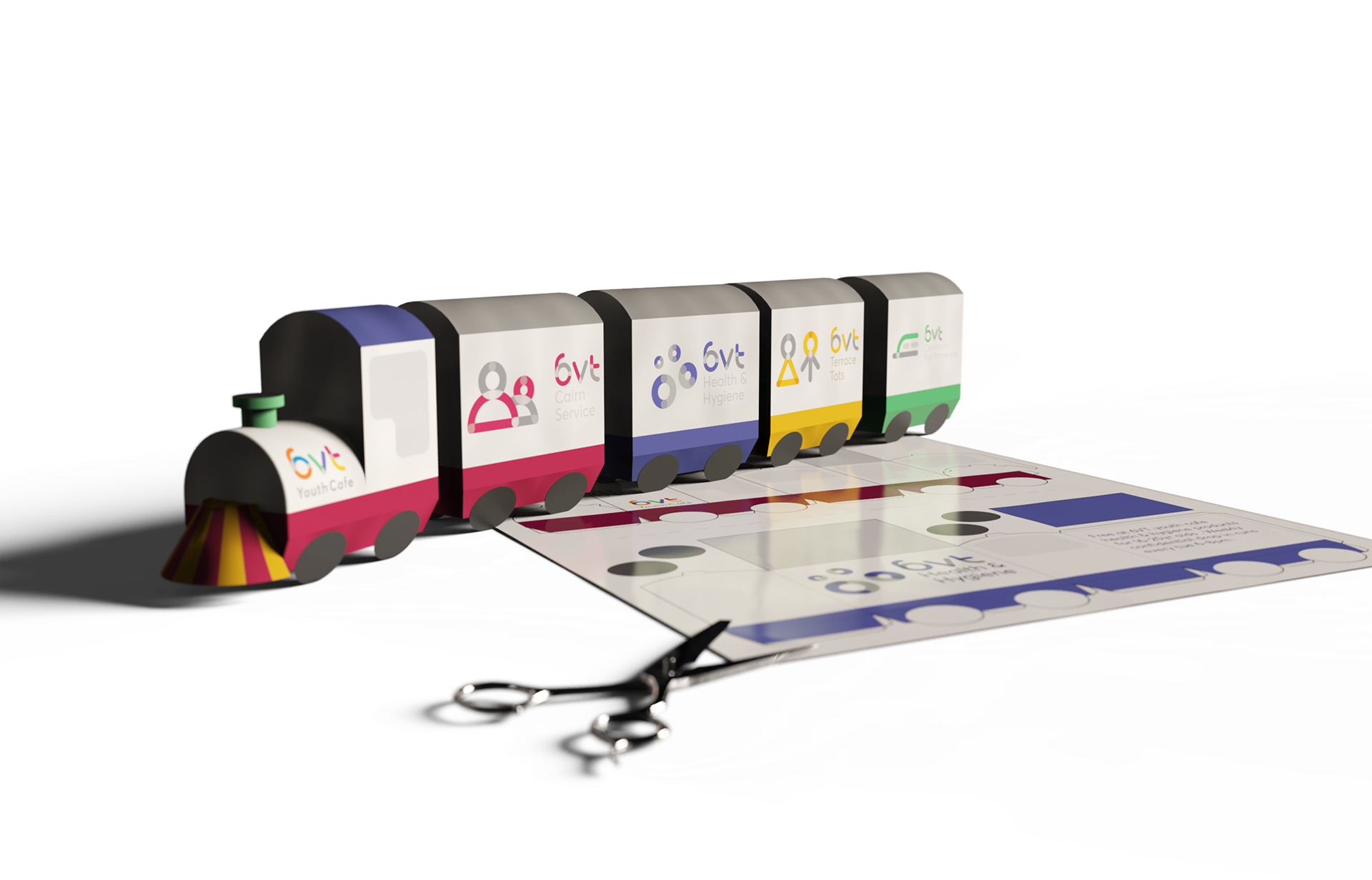
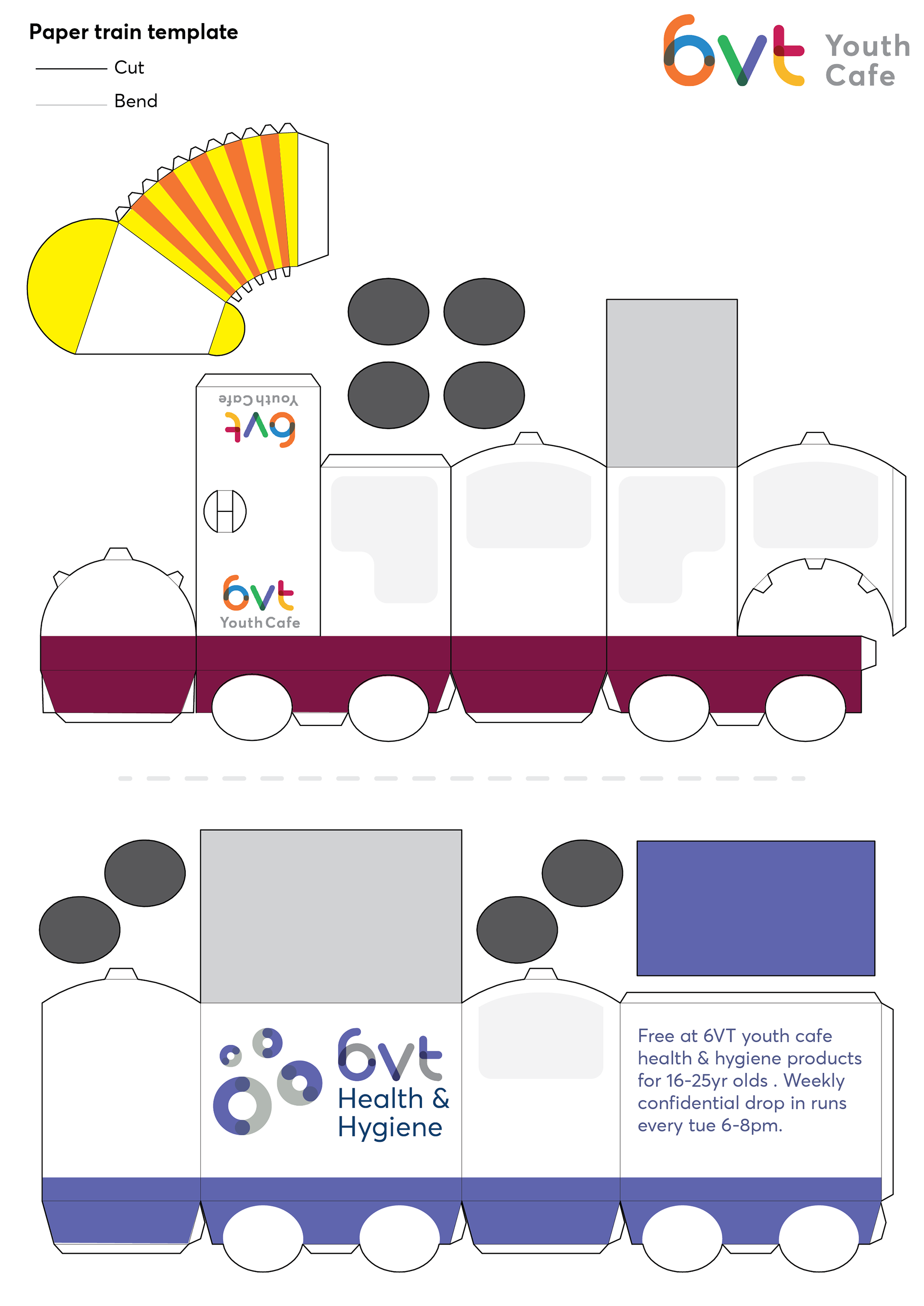
.The system was then used to create a unique identity for each service 6VT offer whilst still having a sense of unity through the same composition and typography.
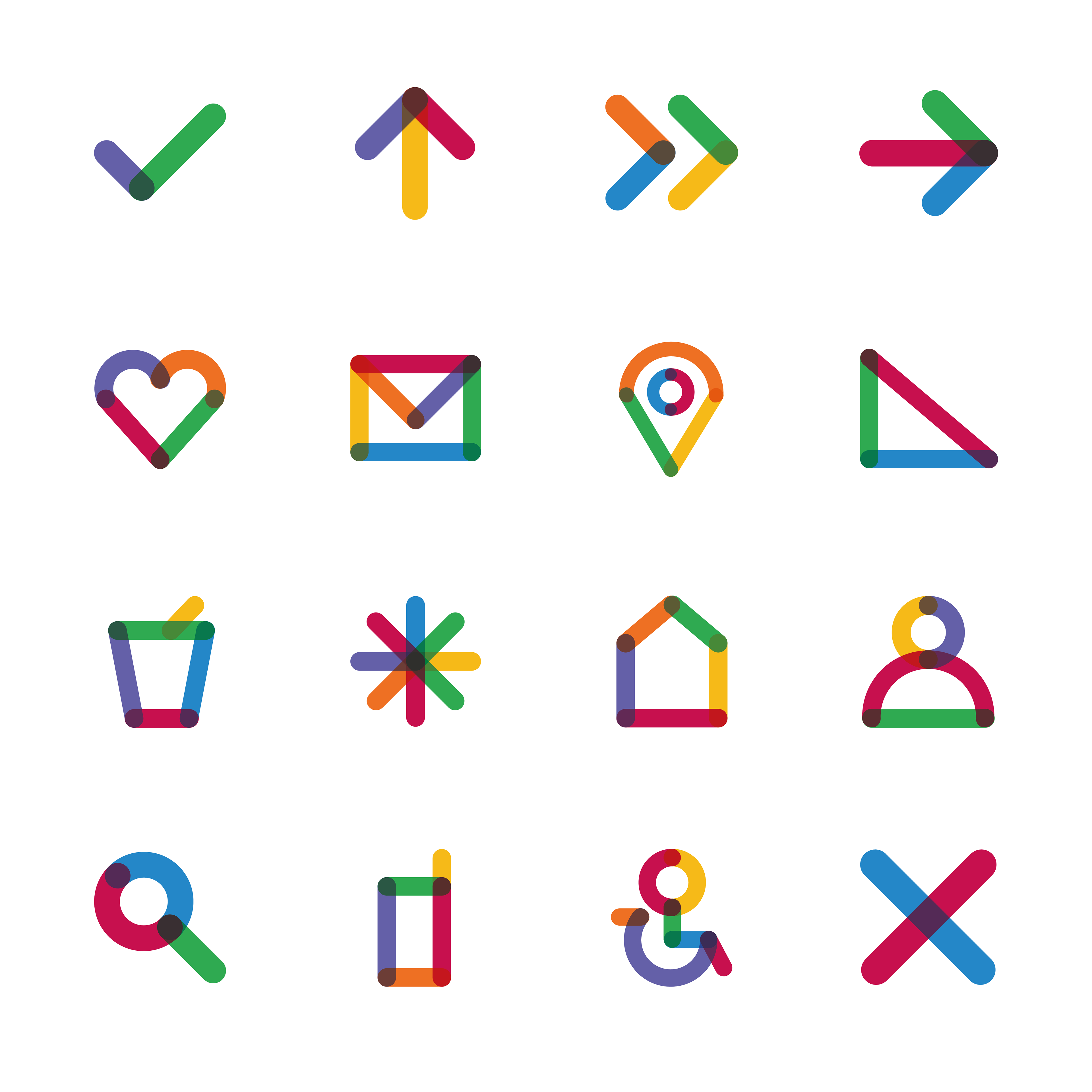
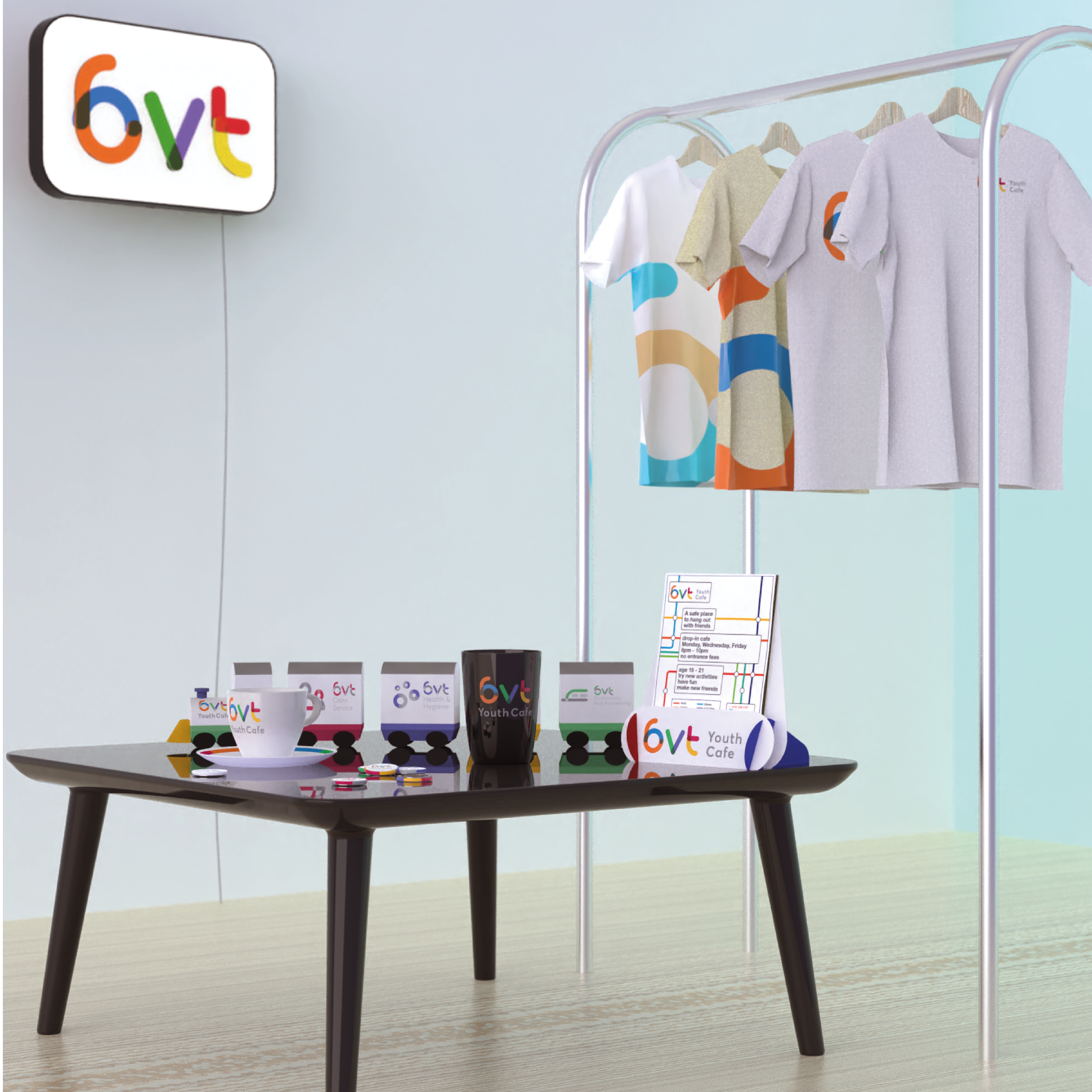
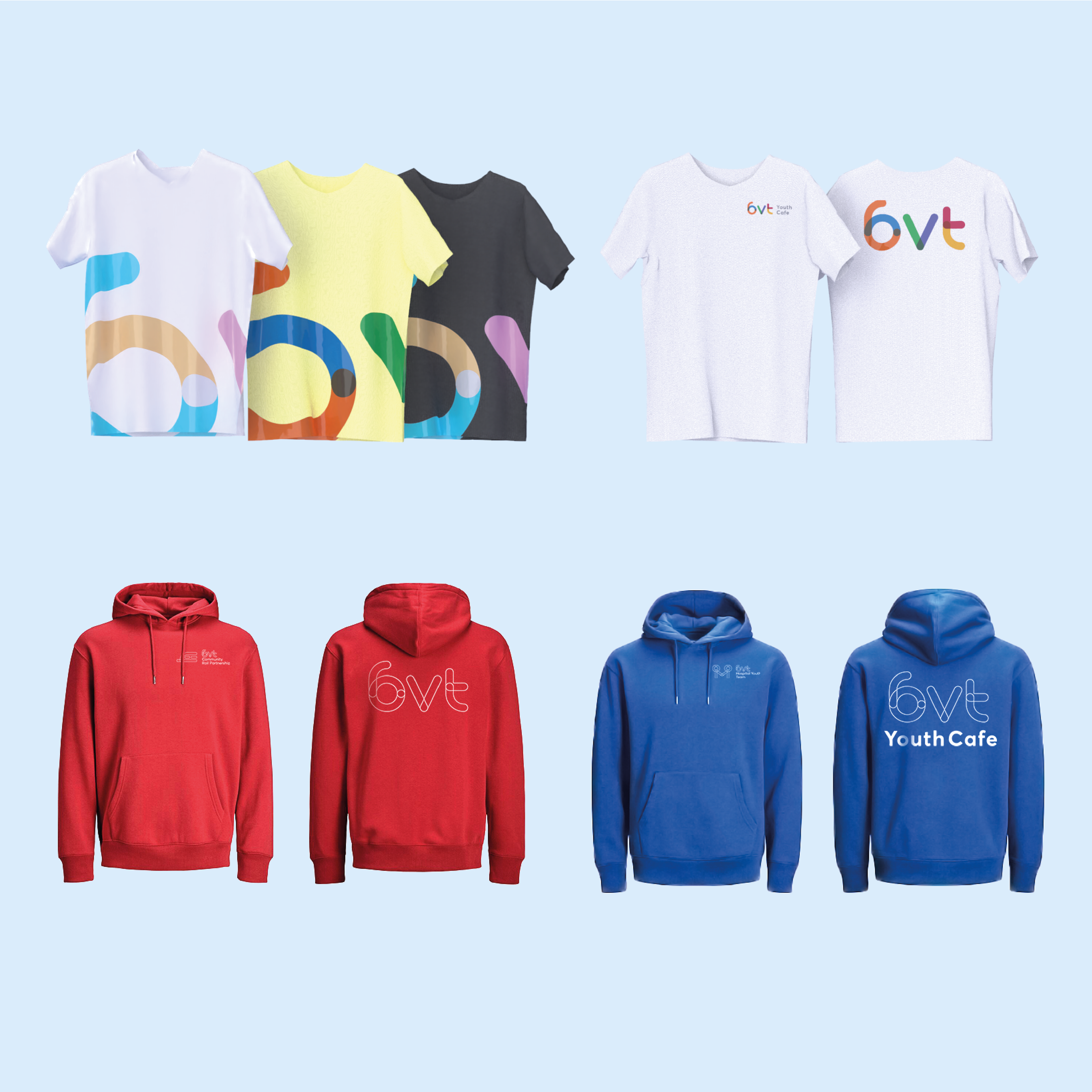
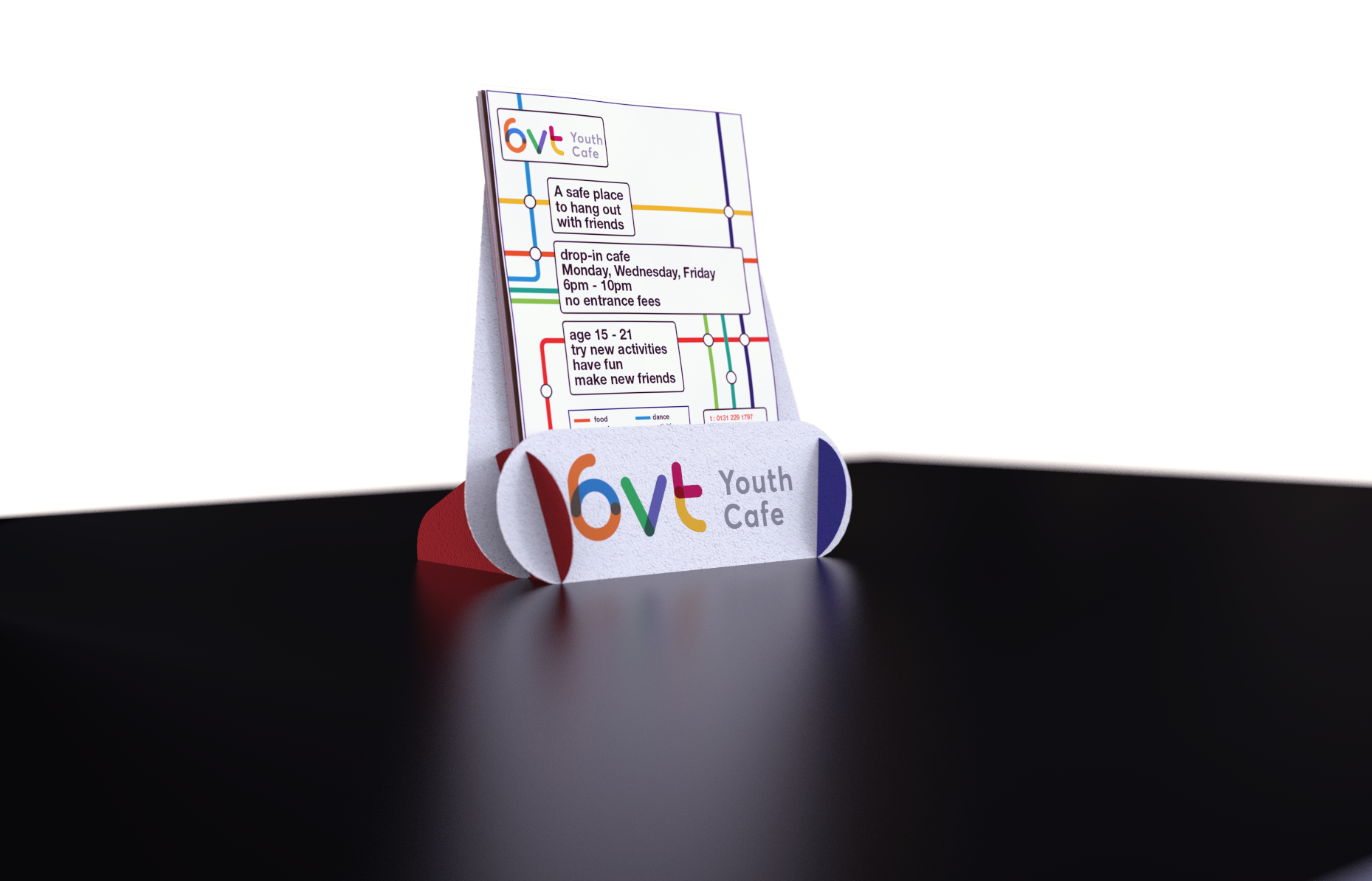
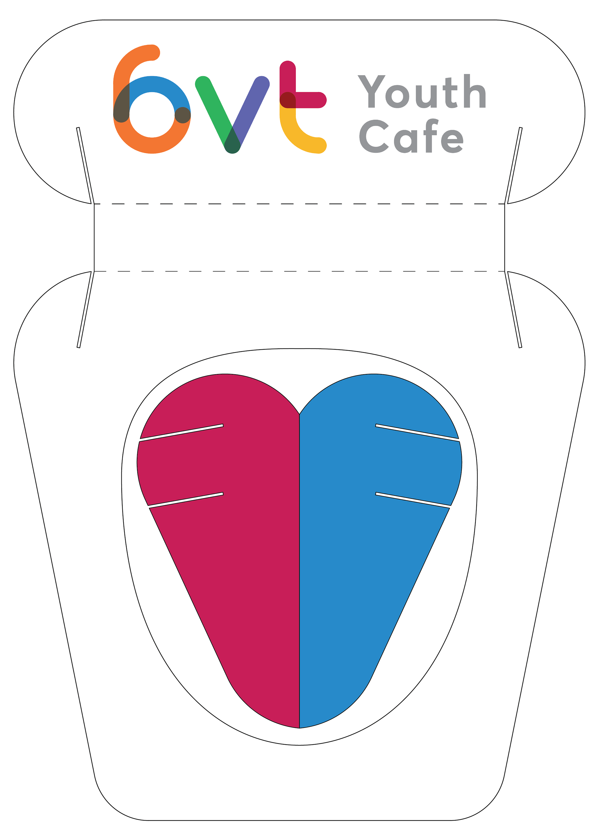
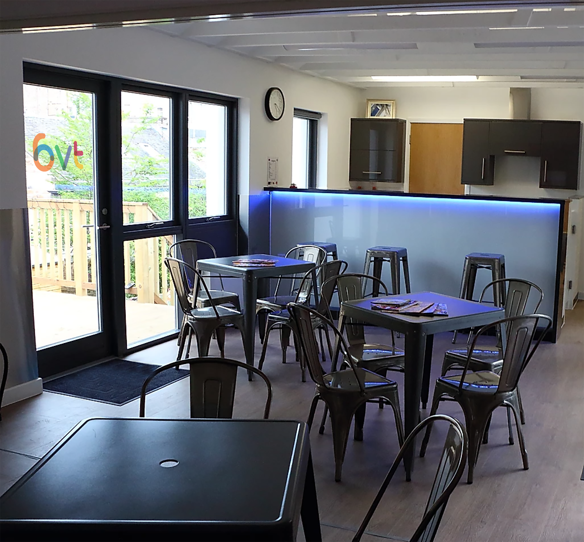
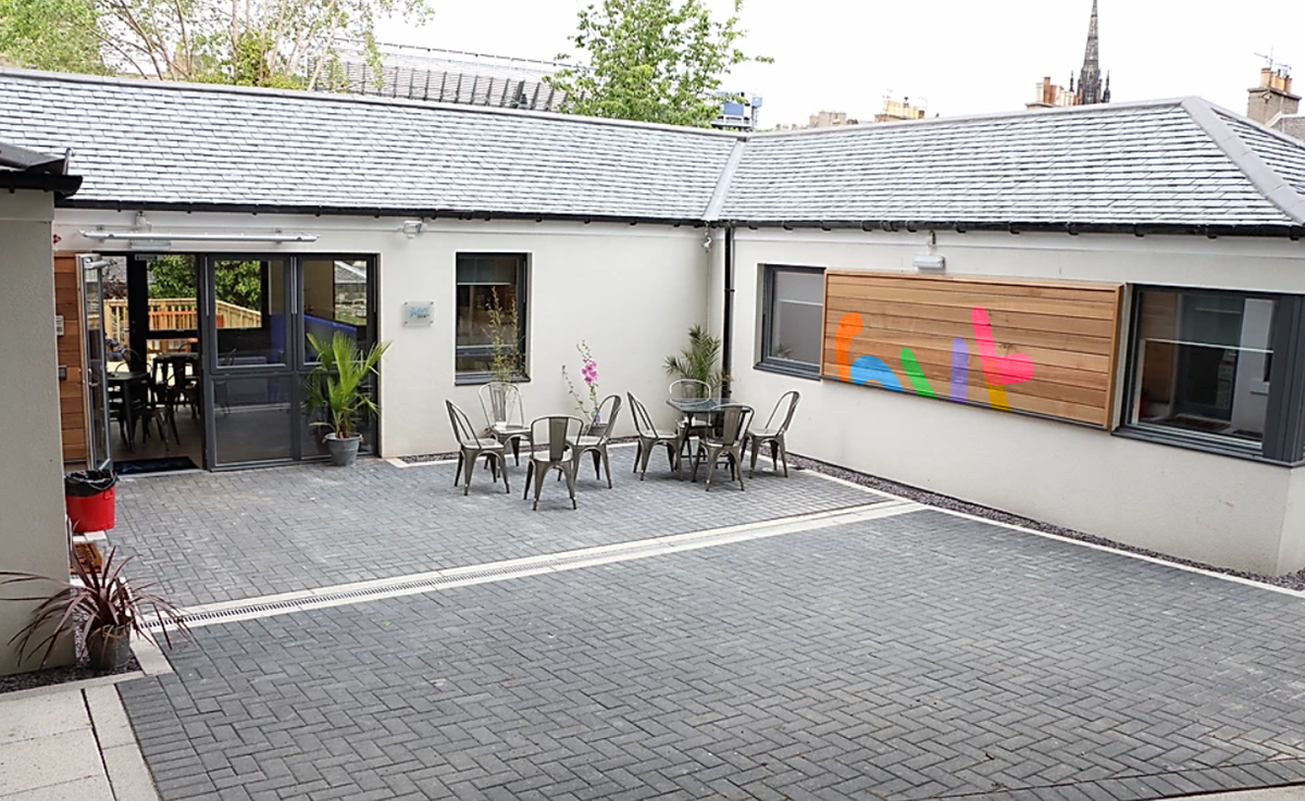
After we had identified a system, we rolled this out onto items that may help the charity including: signage icons, a new website, leaflet holders, clothing and many more.
After we had identified a system, we rolled this out onto items that may help the charity including: signage icons, a new website, leaflet holders, clothing and many more.
The new proposed main marque of 6VT Youth Cafe
The main Logo shows 6 circular lines intersecting and multiplying with each other, something which is symbolic of 6VT and the services that they provide.
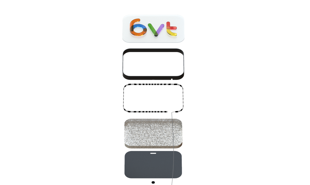
The construction and make up of the the new marque.
The branding system which would be proposed to work alongside the main 6VT marque. Each colour represents a respective service.
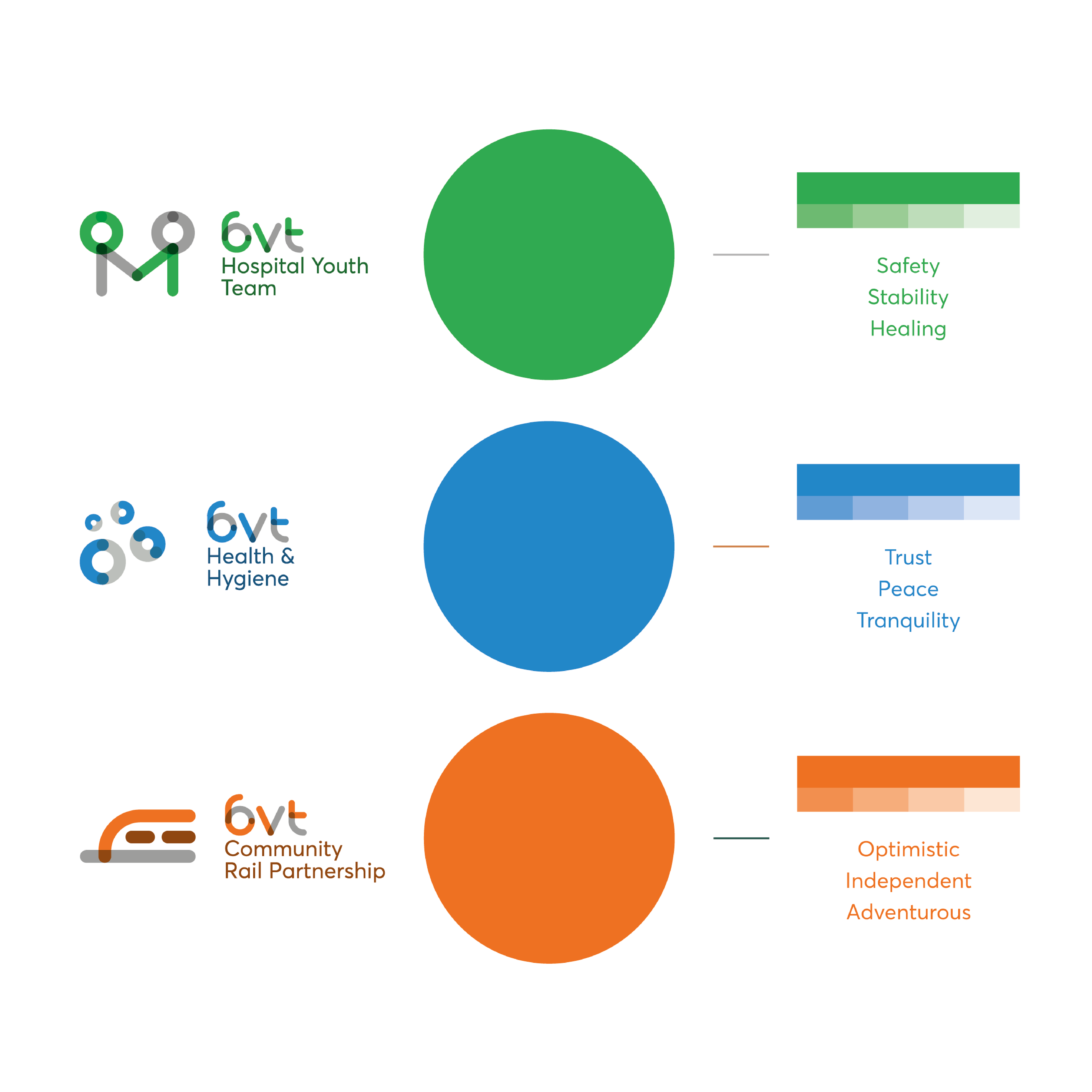
The colours were carefully chosen, taking into account colour psychology and how colours can evoke emotion.

